
Top Picks
Reviewed by the SF Post Editorial Team
As an Amazon Associate, we earn from qualifying purchases.
The best how to hang wall art for your situation depends on how you plan to use it and where.
Last Updated: June 2026 | Written by the SF Post Editorial Team | 8-minute read
> ### The 30-Second Designer Cheat Sheet > > Hang the center of your wall art 57 to 60 inches from the floor. Leave 2 to 3 inches between frames in a gallery wall. Keep art 6 to 10 inches above furniture. Memorize those three numbers and every wall in your home will instantly look intentional instead of accidental.
I have hung, re-hung, and re-re-hung art in three homes over the last several years, and the single biggest mistake I see (and have made myself) is hanging things way too high. A lonely frame floating four feet above the sofa with a sea of blank drywall underneath it screams one thing and one thing only: "I borrowed a hammer from my neighbor and prayed."
We have all been there. The frame goes up. You step back. Something is wrong. You cannot name it, but the whole room suddenly feels like a furniture showroom that forgot the soul.
Good news? Once you internalize a few stupidly simple rules, you will never make that mistake again. Pour yourself a coffee. Grab your tape measure. Let us fix your walls together.
57 inches. That is the gallery-standard height to the center of your artwork. Museums use it. Designers swear by it. Once you measure to it, your walls will never feel "off" again.
The Hidden Reason Most Wall Art Looks "Off" (Even When It Is Beautiful)
Walk into any rental, first apartment, or hastily decorated dining room and you will spot the same heartbreaking pattern: art hung at eye level for whoever happened to be holding the hammer.
The problem? Eye level varies wildly from human to human.
A 6'2" person and a 5'4" person will hang the exact same frame nine inches apart — and both versions will look wrong to half the people in the room. That uncomfortable feeling you get when something is just slightly off? That is your brain noticing a mismatch your conscious mind cannot quite name.
> ### The Insider Truth > > Professional designers do not eyeball heights. They do not trust their gut. They measure. Every. Single. Time. That is the entire secret.
The Magic Numbers That Changed Everything
| The Designer Rule | The Measurement | Why It Works |
|---|---|---|
| Center of artwork | 57" from the floor | Matches gallery and museum standards worldwide |
| Above a sofa | 6 to 8" above the cushion | Visually anchors the seating arrangement |
| Above a console or credenza | 4 to 6" above the surface | Creates that tight, curated, magazine look |
| Gallery wall spacing | 2 to 3" between frames | Reads as one cohesive composition, not chaos |
| Art-to-furniture width | Two-thirds the width of furniture below | Balanced, never that sad "postage-stamp" effect |
Designers solved the eye-level problem decades ago by standardizing to a single reference point: the legendary 57-inch rule, which mimics the average eye level used in museums and galleries around the world. Once I started measuring to 57 inches instead of guessing, my walls stopped feeling chaotic and started feeling designed. The shift was immediate. Embarrassing, even, that I had not been doing it the entire time.
The second silent killer is spacing. Frames jammed too close look cluttered and anxious, like party guests squeezed into a tiny elevator. Frames spread too far apart read as lonely, unrelated objects floating in a vast white void. The sweet spot is narrower than you think — and once you find it, you cannot un-see it.
Watch It Done Right: The Designer Walkthrough
Before you pick up a hammer, take a few minutes to watch a professional demonstrate the exact technique. This is hands-down one of the clearest visual breakdowns of the 57-inch rule on the internet, and it will save you hours of patching mystery holes later.
The Furniture-First Rule: Anchor Before You Hang
Here is the truth nobody tells you: when there is furniture below your art, the 57-inch rule gets overruled by something even more important — visual gravity.
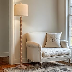
Art is not a decoration that floats in space. It is a partner to your sofa, your console, your headboard. When you treat it like an island, it looks like one.
Your art (or your full gallery arrangement) should span roughly two-thirds the width of the furniture beneath it. A 90-inch sofa wants a piece or grouping that totals around 60 inches wide. Any narrower and it shrinks into nothing. Any wider and it tips visually off the edge.
Quick Anchor Heights by Furniture Type
- Above the sofa: Bottom of frame sits 6 to 8 inches above the back cushion. Never higher.
- Above a console or credenza: Bottom of frame sits 4 to 6 inches above the surface. Tight is good here.
- Above a bed: Bottom of frame sits 8 to 10 inches above the headboard for the right "crowned" effect.
- Above a dining buffet: Bottom of frame sits 6 to 10 inches above the surface, slightly higher for drama.
- In a hallway or stairwell: Default to the 57-inch center rule since there is no furniture to anchor against.
Gallery Walls: The Pro Trick That Saves Your Drywall
Gallery walls are the most rewarding — and the most terrifying — wall-art project in any home. One misplaced nail and you are spending Sunday with a tub of spackle and a YouTube tutorial.
There is a better way. And it is so obvious you will laugh.
> ### The Kraft Paper Method > > Trace every frame onto kraft or butcher paper. Cut them out. Tape the paper templates to the wall first. Move them around for as long as it takes. Mark the nail spot on the paper, hammer through it, then tear the paper away. Zero mystery holes. Zero regret.
Gallery Wall Spacing Cheat Sheet
| Frame Size | Spacing Between Frames | The Vibe You Get |
|---|---|---|
| Small (under 11x14") | 1.5 to 2 inches | Tight, editorial, magazine-grid feel |
| Medium (16x20" to 18x24") | 2 to 3 inches | Classic gallery look, universally flattering |
| Large (over 24x36") | 3 to 5 inches | Bold, breathing room, statement-making |
| Mixed sizes | 2.5 inches as your anchor | Cohesive even when frames are different |
Start by anchoring your largest piece slightly off-center (this is the secret), then build outward like a puzzle. Heaviest visual weight at the bottom. Lightest pieces near the top. Always.
See a Gallery Wall Come Together From Scratch
If you are a visual learner (most of us are), this next video is gold. Watch a designer build a real gallery wall from empty drywall to finished masterpiece — paper templates and all.
The Five Layouts Designers Actually Use
Forget Pinterest chaos. There are really only five gallery layouts that consistently look professional. Pick one, commit to it, and your wall will feel intentional rather than improvised.
1. The Symmetrical Grid — Same frame, same mat, same spacing. Quiet, confident, never wrong. Perfect for bedrooms and offices.
2. The Salon Wall — Densely packed, mismatched frames floor to ceiling. High drama. Best in entryways, stairwells, and dining rooms.
3. The Linear Row — Three to five identical pieces in one perfectly straight horizontal line. Modern, calm, hallway gold.
4. The Anchor-and-Cluster — One large statement piece with smaller works orbiting around it. The single most forgiving layout for beginners.
5. The Asymmetric Balance — Different sizes balanced by visual weight rather than mirror symmetry. The hardest to nail, the most rewarding when you do.
Tools Worth Owning (And the Ones You Can Skip)
You do not need a fancy laser level or a contractor-grade stud finder. You need exactly four things — and most of them are already in a drawer somewhere.
Your Wall-Art Starter Kit
- A 25-foot tape measure. Non-negotiable. Stop guessing.
- A basic bubble level (or the level app on your phone, which is shockingly accurate).
- Painter's tape. For marking heights on the wall before you commit to a single hole.
- Heavy-duty picture hangers rated for double the frame weight. Drywall is unforgiving. Overbuild it.
The Most Common Mistakes (And How to Fix Them Tonight)
Mistake #1: Hanging Too High. If you can comfortably read the title of a book on the bottom edge of your frame while standing, it is probably too high. Lower it.
Mistake #2: Tiny Art Over a Big Sofa. A 16x20 frame above an 8-foot sectional looks like a postage stamp on a billboard. Go bigger or go grouped.
Mistake #3: Inconsistent Spacing. Wandering gaps between frames look like an accident. Pick one spacing number and apply it ruthlessly.
Mistake #4: Ignoring the Light. Sun-bleached art is heartbreak. Avoid hanging valuable or color-sensitive pieces in direct afternoon sunlight.
Mistake #5: Forgetting the Negative Space. Empty wall around your art is part of the composition. Resist the urge to fill every square inch.
Your Five-Minute Action Plan
Close this article. Walk to your most-used room. Take five minutes and do these three things:
- Measure the center of your existing wall art. Is it within an inch of 57? If not, you have found your first project.
- Eyeball the gap between your largest art piece and the furniture beneath it. More than 10 inches? Lower it.
- Count the frames in your most ambitious wall. Are they spaced consistently, or is it a guessing game? Pull out painter's tape and remap them tonight.
Designing a beautiful wall is not about expensive art or fancy tools. It is about three numbers, one tape measure, and the courage to make a pencil mark before you swing a hammer. You already have everything you need. Go fix a wall tonight.
Have a wall that is giving you trouble? Snap a photo, measure to the center of the artwork, and compare it to the 57-inch rule. Nine times out of ten, that one number is the answer.
Key Takeaways
- Choosing the right how to hang wall art means matching capacity and output ports to your actual devices
- Always check actual watt-hours (Wh), not just watts — runtime depends on Wh, not peak output
- Also covers: gallery wall layout
- Also covers: wall art height rule
- Also covers: spacing between frames
- Compare price-per-Wh across models to find the best value for your budget